


The Secret Mind-Control of Hues: Why Color in Visual Arts Makes You Feel
A conversational deep dive into color theory, explaining how complementary and analogous colors, along with psychological associations, are used by visual artists to manipulate the viewer's emotions instantly.
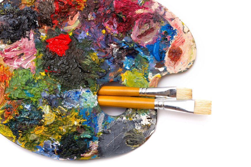
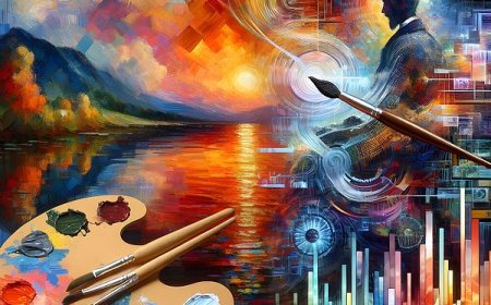
Seriously, think back to the last time some piece of visual art—a painting, a photograph, a sculpture, or even a graphic design piece—hit you right in the gut. You felt a jolt of energy, or maybe a sudden wave of quiet calm. I'm going to bet you ten dollars it wasn't just the subject doing the heavy lifting; it was almost certainly the color.
Color isn't just about making things look pretty. It's the most powerful, fastest, and most totally silent communication system an artist has in the visual realm. It completely bypasses your rational brain and goes straight for your gut reaction.
To truly appreciate the deep emotional current running through any artwork, we first have to figure out the code the artists are using, and that starts with the logic of Color Theory.
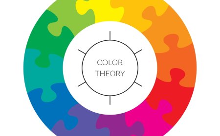
The Color Wheel Isn't Just for Kids
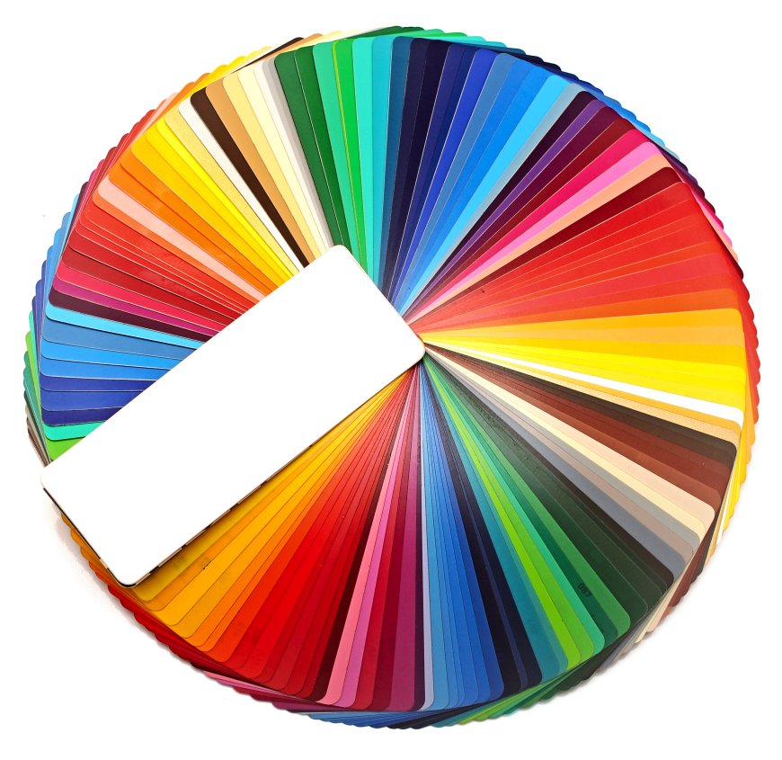
Color theory—it sounds super academic, right? But really, it’s just the smart, organized logic behind choosing colors to create a particular vibe, whether that’s harmony or total visual chaos. And it all begins with that simple circle, the color wheel, which shows us how every single color connects.
What the Relationships Tell Us
Visual artists use the positioning of colors on that wheel like a conductor uses a baton—to lead your eye and set the mood.
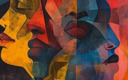
- Complementary Colors (The Visual Fight): These are the exact opposites, sitting right across the wheel from each other. Think Blue and Orange, or maybe Red and Green. When they rub shoulders, they create the most insane, eyeball-popping contrast you can get. They essentially make each other look brighter, almost vibrating. Artists pull these out when they need you to feel tension, drama, or maximum energy. They don’t want you to relax.
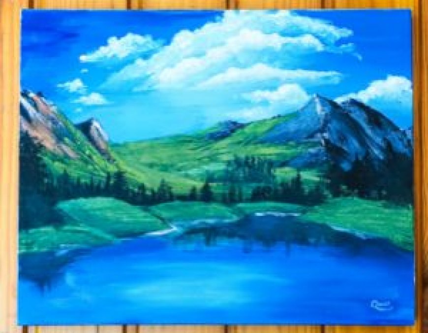
- Analogous Colors (The Gentle Neighbor): Now these guys are friendly. They're colors that are right next door to one another, like Green, Yellow-Green, and Yellow. Using these together creates this wonderful, calming sense of harmony and unity. They’re the colors of a quiet garden—tranquil, unified, and perfect for when the artist wants to convey a soft, gentle atmosphere.
- Temperature (The Emotional Thermostat): Every color has a temperature, doesn't it? Warm Colors (all those Reds, Oranges, and Yellows) feel active, exciting, and they seem to jump forward at you. On the flip side, Cool Colors (Blues, Greens, and Violets) feel peaceful, or maybe a little bit sad, and they visually recede into the background. Master that temperature, and you master the atmosphere and sense of depth.
Color's Deep, Psychological Punch
It gets really interesting when we move past the technical stuff. Because colors carry deep, powerful psychological baggage and cultural memories that artists just exploit—I mean, use—like emotional shortcuts. Your reaction is often a reflex, kicking in long before you even realize what the image is.
Common Emotional Associations We All Share
Specific colors are tied to universal or cultural feelings:
- Blue: Trust, Loyalty, and a little bit of the "Blues." It’s the color of the vast sky and deep water, suggesting stability and calm. But hey, it’s also the go-to color for loneliness or sadness.
- Red: Passion, Power, and PURE Alertness. This is the color of extremes. It’s love and desire, but it’s also blood, aggression, and the "STOP" sign. It's simply the loudest color.
- Yellow: Happiness, Optimism, and Warning. It’s sunshine! It symbolizes joy and sharp intellect. But if it gets muddy or pale, it can suddenly become associated with sickness or caution.
- Green: Growth, Nature, and—yep—Envy. We instantly connect it to life, growth, and the environment. But don’t forget that cultural baggage: it's also the color of money and, in some places, jealousy.
When Visual Artists Become Psychologists
Whether they’re painting, sculpting (through pigment application), or lighting a photo, artists don't just use these colors; they strategically build emotional stories with them.
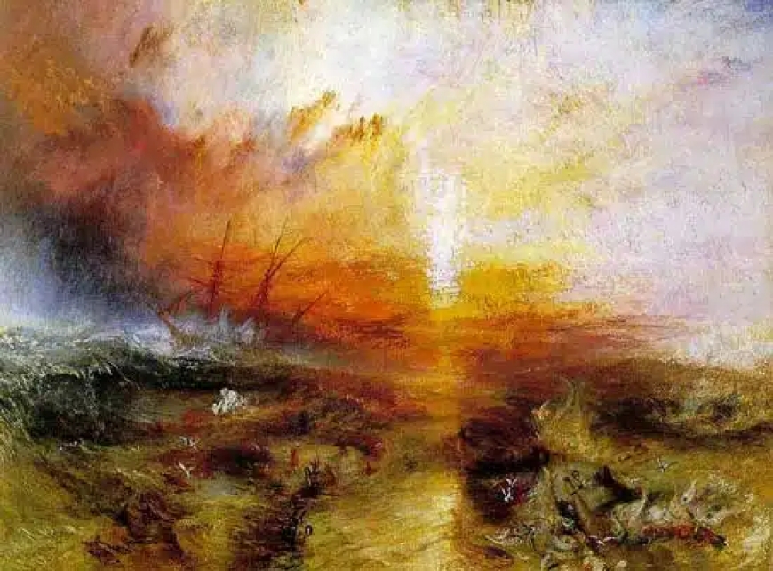
- Van Gogh's High Voltage: When Vincent van Gogh was painting, he wasn't trying to calm anyone down. He wanted to scream his internal chaos onto the canvas! That's why he relied on colors with tremendous tension—those aggressive yellows fighting those vibrant blues. It makes his scenes feel frantic and utterly alive.
- Monet’s Peaceful Dissolve: Contrast that with Claude Monet. Look at his famous Water Lilies. He typically stuck to soft, closely-related (analogous) blues, greens, and violets. Why? Because eliminating those clashing contrasts makes the entire scene feel so tranquil and meditative. The hard edges disappear, and you feel nothing but calm.
So, when you understand the simple logic of the color wheel and how it plays into our psychology, you stop just glancing at a piece of visual art. You start feeling it exactly the way the artist calculated. You’re finally reading the silent, coded language they used just to talk to your heart.
What's Your Reaction?
 Like
0
Like
0
 Dislike
0
Dislike
0
 Love
0
Love
0
 Funny
0
Funny
0
 Angry
0
Angry
0
 Sad
0
Sad
0
 Wow
0
Wow
0