


The Invisible Strings: Why Ethical Design Matters More Than Ever
Stop getting tricked! Learn what dark patterns are, how manipulative UI erodes trust, and discover the essential principles of ethical design for digital well-being and reducing cognitive load.
Let's be real—have you ever felt tricked online?
You know the feeling. You signed up for a "free trial," only to get unexpectedly billed months later. Or you just wanted to unsubscribe from a newsletter, and the website sent you down a rabbit hole of confusing clicks. If that sounds familiar, you’ve been face-to-face with a "dark pattern."
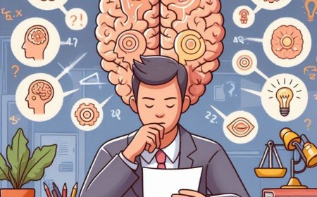
It's a huge issue. As our lives get more digital, the line between helpful design and sneaky manipulation has become totally blurry. For anyone building digital products—designers, developers, even business owners—it's absolutely vital that we understand these invisible strings. Why? Because we have to build an online world that is more trustworthy, more respectful, and frankly, more human.
The Problem: Dark Patterns Are Everywhere
A decade ago, a UX designer named Harry Brignull came up with the term "dark pattern." His definition was simple: design tricks used in apps and websites to make you do things you didn't really want to do, like getting accidental insurance on your flight or signing up for subscriptions you don't need.
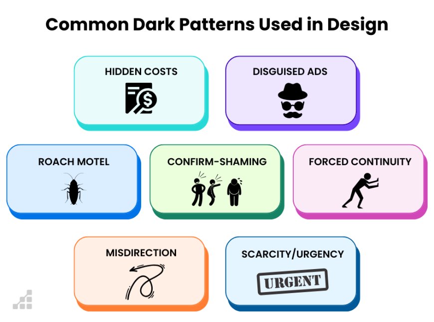
They're masters of disguise, hiding in plain sight. Here are a few you definitely need to watch out for:
- The Roach Motel: It’s easy to check in, but impossible to check out. Think of that five-step cancellation process for a subscription service. Ugh.
- Sneak into Basket: You hit the checkout page, and suddenly, an extra fee or item (like a donation) has been added without you ever agreeing to it.
- Confirmshaming: They try to guilt you into making a choice. Instead of a simple "No," the button says something like, "No thanks, I prefer to ignore this amazing deal." It's manipulative!
- Hidden Costs: The price looks great until the very last click, where a bunch of unexpected "processing fees" pop up.
These patterns don't just annoy us. They absolutely shatter trust. They cause users financial loss, make them feel frustrated, and generally make the internet a worse place. And while businesses might get a quick bump in sign-ups, they destroy the one thing that truly matters: customer loyalty.
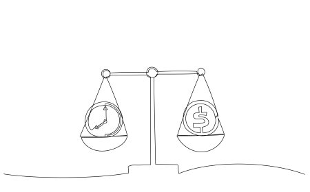
The Root Cause? Money, of course.
Why do these shady patterns exist? It mostly boils down to intense pressure to hit certain business metrics—more clicks, higher sign-ups, more revenue. When a design team is under the gun to meet a target, a dark pattern can look like a fast, easy, even if totally unethical, shortcut.
But here’s the thing: a business that lasts—a business built on respect—will always beat a business built on deception. That's where Ethical Design comes in.
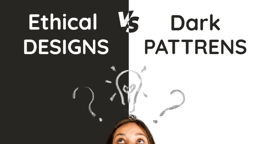
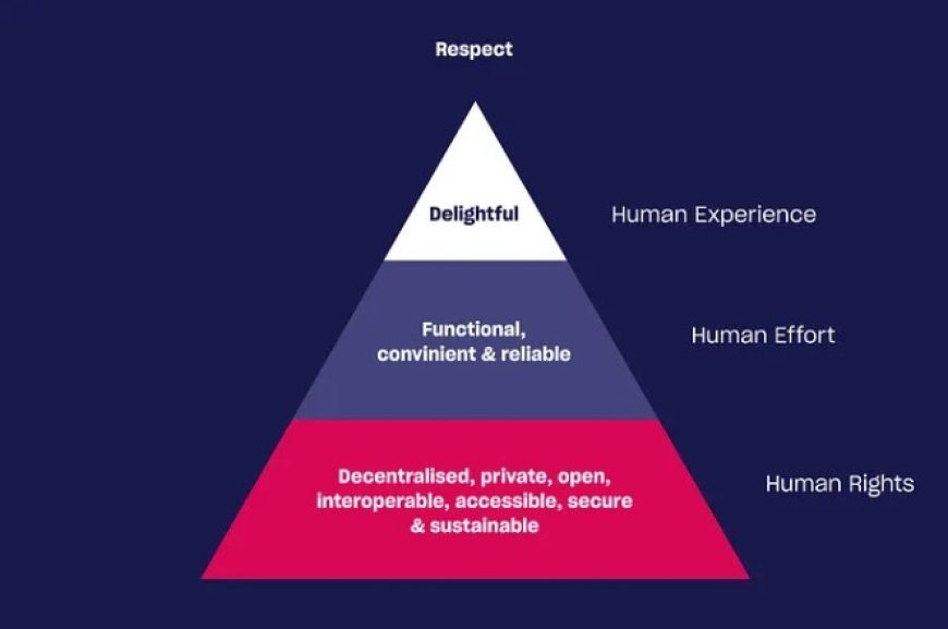
The Solution: Designing Like a Human
Ethical design is the exact opposite of a dark pattern. It puts the user’s best interests first, prioritizes transparency, and creates interfaces that are helpful, intuitive, and truly respectful. It's about giving power to the user, not taking it from them.
We can break ethical design into two core ideas: digital well-being and reducing cognitive load.
1. Designing for Digital Well-being
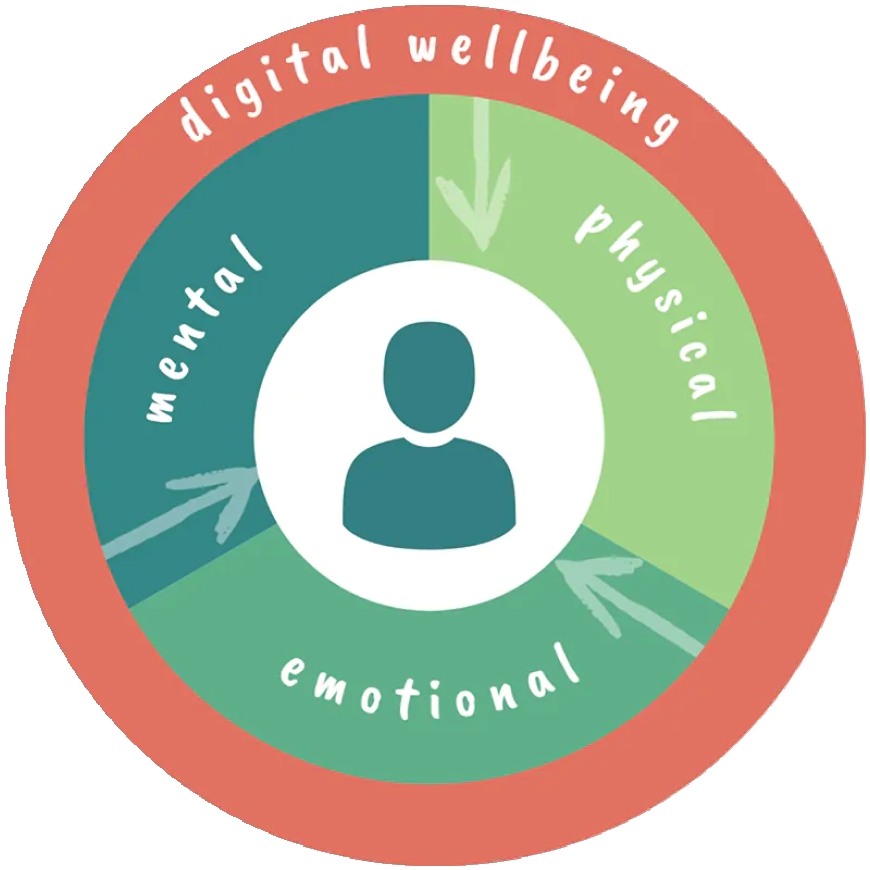
- Be 100% Transparent: Tell the user clearly and simply what will happen next. No tricky checkboxes. No hidden fees. If they're opting into an email list, be clear about how often you'll email them.
- Give Real Control: Users need to easily manage their data, their privacy settings, and their notifications. If I want out, let me out quickly and with dignity. Don't make me call an 800 number just to cancel a free trial!
- Mindful Engagement: We shouldn't design things to be addictive. We should design them to be effective. The goal isn't endless screen time; it's helping the user finish their task and move on with their life.
2. Reducing Cognitive Load
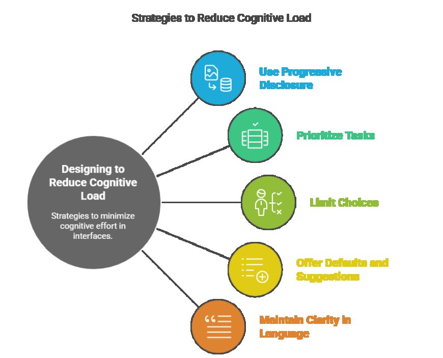
- Keep it Simple: The interface needs to be crystal clear. Use straightforward language—don't write a PhD thesis for a simple button label.
- Make it Intuitive: Navigating an app shouldn't feel like solving a puzzle. If I have to think hard about where the settings button is, you’ve failed the user.
- Stop the Clutter: Every unnecessary notification, every flashing ad, and every confusing menu item adds to "cognitive load." This means it takes more mental effort to use the product, leading to user exhaustion and frustration. A clean, focused screen is a respectful screen.
- Use Sensible Defaults: When a user is setting up a new service, the default options should benefit them, not just the company. Defaulting to high privacy is ethical; defaulting to maximum data sharing is not.
It's Time for a Design Stand
The good news is that people are waking up. Dark patterns are now facing real scrutiny from users, government regulators, and within the design profession itself. Major tech companies are starting to integrate more ethical practices.
But real change starts with us.
As consumers, we have to be more aware. If something feels fishy online, it probably is. We should actively choose to support brands that treat us with dignity.
And as creators, we have a clear responsibility. We have to be the ones asking the tough questions: "Does this design truly respect the person using it?" We need to choose the long-term integrity of our product over the short-term win of a manipulative trick.
Designing ethically isn't just about avoiding the bad stuff; it's about actively creating the good stuff. It's about making digital experiences that are functional, beautiful, and, most importantly, transparent and profoundly respectful of the human beings on the other side of the screen. This isn't just a trend; it's the future of design.
What's Your Reaction?
 Like
0
Like
0
 Dislike
0
Dislike
0
 Love
0
Love
0
 Funny
0
Funny
0
 Angry
0
Angry
0
 Sad
0
Sad
0
 Wow
0
Wow
0