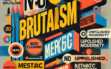


More Than Just Font: How Typography Defines Your Brand's Voice
Stop overlooking the silent power of type. Discover how careful typography—from serif choices to line spacing (leading)—is a strategic investment that fundamentally shapes your brand’s voice and credibility.
Stop Overlooking It: How Typography Actually Defines Your Brand's Voice
Look, we all know the drill. You're building a brand, and what do you focus on? That awesome logo, the splashy color palette, and maybe even a killer tagline. You spend weeks on these elements. But I’m here to tell you there’s this incredible, quiet powerhouse working beneath it all, shaping perceptions and driving communication before anyone reads a single word: typography.
We need to get past the idea that good typography is just about picking a nice-looking font. It’s not. It’s a fiercely strategic design element. It literally has the power to make or break your entire visual identity, influencing everything from the ease of reading to the very emotional connection your customer feels with your product.
The Silent Communicator: What Your Typeface is Really Saying
Before a customer consciously processes a word like "luxury," "reliable," or "innovative," their brain has already sucked up cues from the font itself. Seriously. Every typeface carries its own baggage—its own history, its own inherent mood.

- Serif Fonts: You know, the ones with those little feet or stroke embellishments. They are the bedrock of stability. Serifs often convey tradition, deep-seated trustworthiness, authority, and old-school elegance. Think high-end fashion houses, The Wall Street Journal, or established law firms. They scream heritage and respectability.
- Sans-Serif Fonts: No feet here. This is the font of the modern age. Sans-serifs project a clean, minimalist, and very current aesthetic. It's why they’re the go-to for tech companies, contemporary brands, and anything designed primarily for a screen. They’re crisp, efficient, and immediately legible.
- Script Fonts: These are the beautiful, cursive ones that mimic handwriting. They absolutely nail that personal touch, suggesting creativity, warmth, or a refined, handmade quality. They’re fantastic for wedding invites or boutique labels, but do not use them for long paragraphs, unless you actively enjoy giving people headaches.
The point is this: you can't just throw a dart at a font list. Your typeface choice has to be a deliberate, almost philosophical decision, aligned perfectly with your brand’s core values and the audience you’re trying to charm.
Beyond Selection: Getting Your Hands Dirty with Arrangement
Okay, so you've nailed the font choice. Great. Now comes the real craft: how you arrange and present the text. A truly talented typographer ensures effortless readability while smoothly guiding the user through every piece of information.
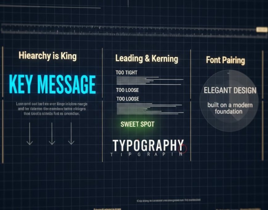
- Hierarchy is the King: This is the golden rule, no question. By fiddling with font size, weight (boldness), and color, designers establish a visual pecking order. The job of the headline is to punch you in the eye; the subheadings break up the long read; and the body text delivers the goods. It’s an organized conversation, not a wall of text.
- Leading (Line Spacing): It's just the space between lines, but it's hugely important. "If you set the leading too tight, the text instantly transforms into an uninviting, dense mess. Conversely, if it’s too loose, the lines seem to drift away from each other. We’re really aiming for that sweet spot—a comfortable line spacing that just makes the text feel welcoming and completely effortless to follow
- Kerning & Tracking: These are the obsessive details. Kerning is adjusting the space between just two letters—absolutely critical for huge headlines where odd spacing looks glaringly unprofessional. Tracking adjusts the space across an entire block. Fine-tuning these ensures a polished, high-end appearance.
- Font Pairing: This is the fun part, mixing and matching. Successfully combining two typefaces (like a heavy serif headline with a light sans-serif body) adds fantastic visual excitement and defines clear roles for each font, provided they don't fight each other. You want contrast that complements, not chaos.
The High Cost of Cutting Typographic Corners
Trust me, you don’t want to be the brand with bad type. Neglecting these basics can lead to several serious issues:

- Poor Readability: If your text is a chore to read, your customers will simply peace out and miss the message.
- Zero Professionalism: Sloppy, inconsistent, or badly spaced type instantly makes your brand look amateurish, untrustworthy, and frankly, behind the times.
- Confused Messaging: A weirdly matched font can send totally conflicting signals, instantly killing credibility. You wouldn't trust a lawyer using a comic book font, would you?
- Accessibility Issues: You absolutely cannot ignore this. Tiny text, low contrast, or overly fancy fonts exclude users with visual impairments. It's a fundamental design consideration today.
- Final Takeaway: Typography is Your Brand’s Voice
In this fast-paced, digital world, attention is gold. Typography, though often taken completely for granted, plays a starring role in crafting a brand identity that’s cohesive, memorable, and—most importantly—effective. It's the quiet force that brings real authority to your mission statement and gives personality to your entire brand narrative.
"So, please, stop viewing thoughtful typography as just another thing on the design checklist. Instead, understand it as a crucial investment in your brand’s actual voice, its ability to connect with its audience, and yes, its ultimate commercial success. Next time a piece of design truly catches your eye, take a second to recognize the real unsung hero that pulled the whole thing together: the pure, incredible power of well-crafted typography."
What's Your Reaction?
 Like
1
Like
1
 Dislike
0
Dislike
0
 Love
0
Love
0
 Funny
0
Funny
0
 Angry
0
Angry
0
 Sad
0
Sad
0
 Wow
0
Wow
0