


Decoding the Mind: The Cognitive Science That Makes Infographics Irresistible
Discover the psychological reasons why infographics are so effective. Learn how visual storytelling reduces cognitive load, boosts memory, and makes complex data instantly shareable.

In a world overwhelmed by data and endless streams of text, the simple infographic has become a king of content. From clarifying complex scientific processes to describing market research, these visual powerful tools don't just look good—they are designed to engage the brain.
The secret to their success isn't just creative design; it's a deep alignment with the principles of cognitive science. Infographics are attractive because they are perfectly suited to the way the human mind processes, remembers, and is ultimately influenced by information.
The Power of Two: Superior Memory and Dual Coding
Infographics unlock the brain's enormous capacity for visual processing it activates the two distinct memory pathways simultaneously at a time .
- The Dual-Coding Theory
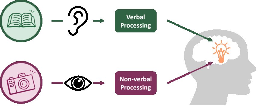
Proposed by psychologist Allan Paivio, the Dual-Coding Theory suggests that information is processed and stored through two separate mental channels:
- The Verbal Channel: Processes language, text, and words.
- The Non-Verbal Channel (Imagery): Processes pictures, diagrams, and visual information.
When you present complex data in a text-only format, it is primarily encoded only through the verbal channel. An infographic, however, pairs that same textual data (labels, statistics) with a corresponding visual (charts, icons, illustrations). This creates two separate mental "tags" for the same piece of information, increasing the high chances of successful recovery later on.
- The Picture Outstanding Effect
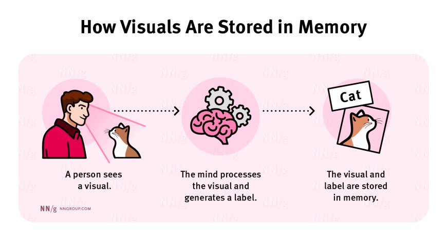
This dual-coding advantage explains the picture superiority effect, a long-established memory phenomenon: people are significantly more likely to remember information presented as images than the same information presented only as words.
The brain processes visual information nearly instantaneously. By embedding key data points into recognizable shapes, charts, and icons, infographics ensure that a viewer's memory trace is stronger, more robust, and more easily recalled that memory after a weeks or months .
The Cognitive Load Principle: Reducing the Burden
The biggest challenge is to communicate the often cognitive load, which is the mental effort required to process new information. Our working memory—where we temporarily hold and manipulate information—is extremely limited. Text type -heavy documents quickly removes this capacity, leading to frustration and disinterest.

- Minimizing Additional Load
A well-designed infographic directly addresses this by minimizing additional cognitive load (the unnecessary effort caused by poor design),It achieves this by:
- Reading Information: Data is naturally broken down into small, digestible segments or sections, reducing the feeling of being overloaded.
- Integrating Text and Visuals: By placing text labels directly next to the appropriate chart, arrow, or icon, the infographic eliminates the need for the brain to rapidly search and match visual data with distant text blocks—a task that is a major source of unnecessary load.
- Visual Organization: Using size, color, and placement to clearly indicate the most important information guides the viewer's eye and focus, preventing cognitive confusion.
By using simple icons and clear design, infographics transform a task of complex reading and analysis into one of pattern recognition, making learning feel fast and effortless.
The Path to Influence: Storytelling and Emotional Connection

Infographics is not just an informational tools ; there are powerful engines of communication. They utilize the brain's preference for narrative and emotion, bypassing pure logic to drive belief and action.
- Elaboration Likelihood Model (ELM) -Method apply
According to the convincing Elaboration Likelihood Model (ELM), people take two paths when processing messages:
- Central Route: High-effort processing based on the quality and logic of the arguments (facts, data).
- External Route: Low-effort processing that relies on surface indicators (emotional connection, aesthetics, and source credibility).
Infographics appeal to both routes simultaneously. The clear, visual presentation of data—charts, trend lines, comparisons—provides the strong, logical evidence needed for the Central Route. However, the polished design, custom iconography, and strategic used for color attraction to the low-effort Peripheral Route, building immediate trust and positive connection (the "design aesthetic" heuristic).
- The Fictional Advantage
The most effective infographics use a clear visual storytelling structure (beginning, middle, and end). They often use flowcharts and sequential layouts to:
- Establish as a problem: Using a powerful visual or statistic.
- Introduce the Solution: shows the step-by-step process clearly.
- Shows the Result: Ending with a powerful, memorable call to action or outcome.
This structure makes it possible for the information to flow like a story, which is the most efficient and natural way for people to recognize and retain the information.
Designing for the Brain
Infographics are so effective because their structure and design principles are rooted in fundamental human psychology. They use visual persuasion to foster trust and motivate action, drastically lower cognitive load for effortless comprehension, and leverage the Dual-Coding Theory for superior memory.
When creating your next piece of content, remember that you're not just presenting data; you are designing for the human mind.
What's Your Reaction?
 Like
1
Like
1
 Dislike
0
Dislike
0
 Love
0
Love
0
 Funny
0
Funny
0
 Angry
0
Angry
0
 Sad
0
Sad
0
 Wow
0
Wow
0