


The Speedometer: Why This Simple Dial Is the Ultimate Infographic
Discover why the analog speedometer is the most effective data visualization tool ever designed. Learn how its principles of action over precision apply to creating powerful infographics.
The Power of Infographics, Hidden in Plain Sight
Infographics are often viewed as complex digital posters filled with pie charts and statistics. Bthe core principle of an infographic is simplify complex data into an actionable visual story—is everywhere.
We interact with dozens of data visualizations every day without realizing it—from the line chart on a stock ticker to the color-coded weather map. But perhaps the most effective, most critical visualization in our lives, and the perfect demonstration of infographic design done right, is the humble car speedometer.
It's a brilliant piece of information design that prioritizes action over details, enabling us to make the data safe every second . By breaking down the speedometer's design, we learn the essential rules for creating any successful infographic. Here is why this simple dial is a masterclass in visual communication.
We interact with countless data visualizations daily—from the bars on your phone signal to the rising stock ticker—but few are as crucial as the humble speedometer. It's not just a measure; it's a masterclass in information design that proves actionability is more important than precision.
This simple dial prioritizes gets the right information quick, enabling split-second decisions that keep you safe.
The Fundamental Secret: Power comes from position
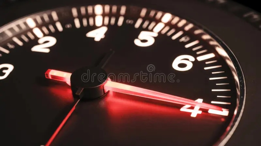
The speedometer is a Radial Gauge Chart, and its brilliance lies in how it exploits human perception.
-
Goal: To communicate your current velocity relative to a critical range (the speed limit).
-
The Insight: Reading the position of the needle (a change in angle) is exponentially faster for the brain than reading a constantly fluctuating digital number ($58 \rightarrow 59 \rightarrow 60$).
The analog design allows you to absorb this critical data peripherally, meaning you can process your speed without taking your eyes and full focus off the road.
Visualization Masterstroke: The Rate of Change Digital displays only show the value.
- The analog needle shows the momentum.When you accelerate, the sweeping motion of the needle beautifully communicates the rate of change (acceleration). You don't just know you're at 60 MPH; you know how fast you got there and how quickly you're still climbing.
- In mathematical terms, the needle visually represents the derivative of the data in real-time—a complex concept delivered via a simple, visceral visual cue.
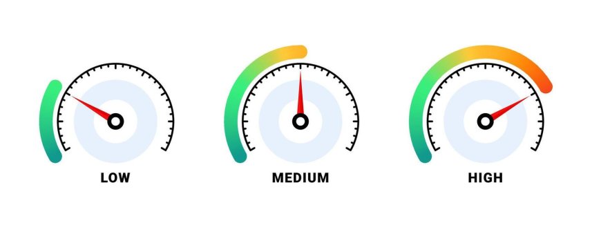
The Hidden Zones: Processing Prior to Attention
The best part of the analog design is the silent communication of risk:
-
Green Zone (Implied): Safe cruising speed.
-
Yellow/Orange Zone: Caution, near the limit.
-
Red Zone: Danger/Limit exceeded.
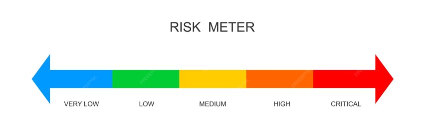
The text "65 MPH" does not need to be read by the eye in order to be compared to the "60 MPH" limit. It only needs to register the needle is pointing into the "Red" position on the dial face, triggering an immediate, necessary response. Data that is communicated without conscious effort is referred to as pre-attentive processing.
The Ultimate Trade-Off: Analog vs. Digital
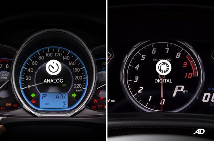
The ongoing debate between analog and digital speedometers highlights the fundamental problem in data visualization design: precision vs. comprehension.
|
Highlights |
Analog Needle(The Victor) |
Digital Display (The Purist of Data) |
|
Speed of Reading |
Very Quick(Peripheral) |
Slower (Requires focused attention) |
|
Clarity of Change |
Outstanding(Shows momentum) |
Poor (just displays value) |
|
Effectiveness |
The highest(position-triggered response) |
Lower (Requires mental calculation) |
|
Precision |
Reduced (needs estimation) |
Highest (displays the exact number) |
Setting Action Priorities
The analog needle is still in use because it is an infinitely better actionable data visualization tool better than because it is technologically superior. The speedometer cleverly forgoes the requirement for perfect numerical accuracy in favor of maximizing comprehension speed in circumstances where a split second counts.
It is the perfect reminder that every successful visualization is ultimately designed to tell a story and drive a decision.
What's Your Reaction?
 Like
1
Like
1
 Dislike
0
Dislike
0
 Love
0
Love
0
 Funny
0
Funny
0
 Angry
0
Angry
0
 Sad
0
Sad
0
 Wow
0
Wow
0