


Why Apps are Turning Yellow: High-Viz Growth
Yellow is taking over the app store. Discover the psychology and "high-viz" business strategy behind 2026's boldest trend for driving user engagement.
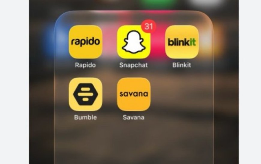
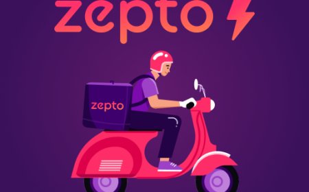
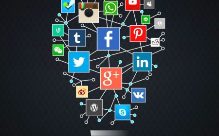
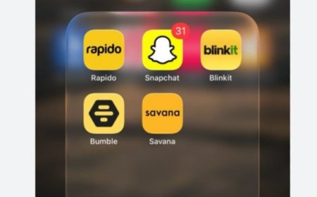
Look at your phone right now. You’ll likely see a sea of "safe" blue icons like Facebook, LinkedIn, and the App Store. But lately, a new wave is taking over: yellow. From global giants like Bumble and Snapchat to fast-growing startups like Zepto and Blinkit, the color yellow is appearing everywhere. This isn't just a random fashion choice by designers. It is a strategic, high-stakes business move. In an economy where your attention is the most valuable currency, these apps aren’t trying to look "pretty"—they are trying to win the war for your first glance.
The move to yellow is a pivot from aesthetic branding (looking good) to performance branding (being found). For years, companies used blue to signal "trust" and "stability." But on a cluttered home screen, blue blends in. Yellow, however, is the most visible color to the human eye. It reflects the most light and triggers our "peripheral vision" before we even consciously look at the icon. For a business, this is a "biological hijack." If an app can shave even half a second off the time it takes for you to find it, they have a massive advantage over their competitors in terms of daily usage and retention.
What is the business strategy?
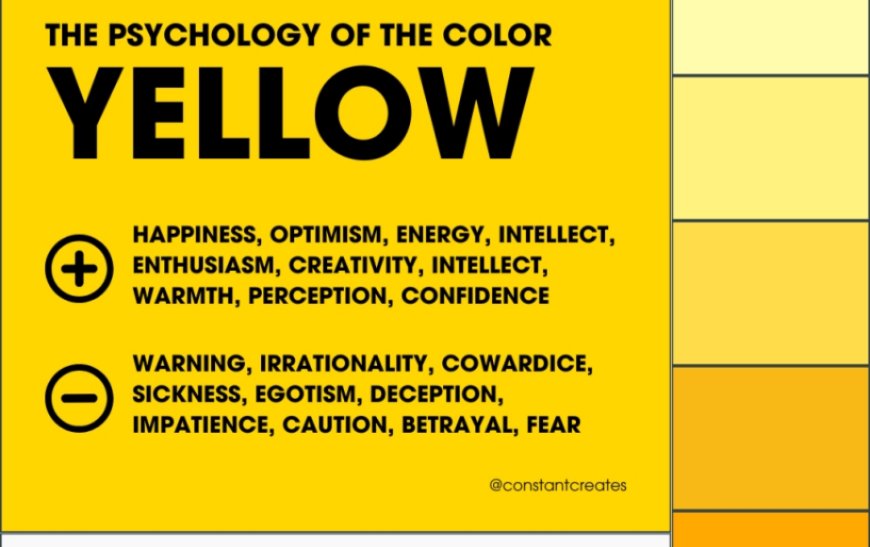
For a company, choosing yellow is a calculated trade-off between brand meaning and immediate utility.

-
The "Speed" Signal: Historically, yellow is the color of taxis, school buses, and warning signs. It subconsciously tells the user that the service is fast, immediate, and energetic. This makes it the perfect "uniform" for quick-commerce and delivery apps.
-
The Contrast Hack: Most smartphone wallpapers are cool-toned (blues, greens, or greys). Yellow sits on the opposite side of the colour wheel, creating the maximum amount of visual "pop." It effectively shouts, "I am right here!" in a digital jungle.
-
The Growth Weapon: For a new startup, yellow is a way to break through the noise. It helps a brand feel "disruptive" and "young" compared to the older, more corporate-looking apps.
So, should every brand jump on the yellow bandwagon? Not necessarily. While yellow is a powerhouse for growth and visibility, it can sometimes feel "loud" or "cheap" compared to premium brands. We are already seeing a counter-move where luxury or high-trust brands (like Apple, Uber, or Notion) are moving toward minimalist black-and-white palettes. They aren't shouting because they’ve already won your loyalty. The ultimate business question isn't "Why yellow?"—it's whether you want to be a tool that is searched for because of its value, or a brand that has to scream to be seen.
What's Your Reaction?
 Like
0
Like
0
 Dislike
0
Dislike
0
 Love
0
Love
0
 Funny
0
Funny
0
 Angry
0
Angry
0
 Sad
0
Sad
0
 Wow
0
Wow
0